In this ongoing series, I am putting together a Github Repository Template for my "Go To" front-end tech stack of Next.js, React, TypeScript etc. After the first 5 parts of the series, I have the base Next.js application, linting, and testing in place (all in TypeScript). In this post, I'm going to add the Material-UI component library.
Material-UI is, in my opinion, a very powerful and very solid component library. It is very seasoned, has great TypeScript support, works well with SSR, and uses the powerful JSS library to make CSS-in-JS simple. Material-UI's use of JSS also includes great things like auto browser vendoring. It is really easy to extend existing Material-UI components and their base set of components is excellent. Why re-invent the wheel?
Just want the Code? View the full changeset covered in this post or check out the 0.0.6 release of the repository. Also, this is heavily based on the (non-TypeScript) example for Material-UI and Next.js.
Prerequisites
If you are following along, please complete part 5 of the series as certain usages of Environment Variables and Path aliases get glossed over here.
Install Dependencies
I will need to install 3 packages from Material-UI: the core library, the styles package, and their awesome icon set (although we don't utilize their icons in this post).
npm install @material-ui/core @material-ui/icons @material-ui/styles
Also, I'll need the JSS types to play nice with TypeScript
npm install --save-dev @types/styled-jsx
Add a Button
To illustrate that Material-UI is installed, I will add a Button component to the IndexContent.tsx we created in previous posts.
// / src/screens/IndexContent.tsx

import React from 'react';
import getConfig from 'next/config';
import Button from '@material-ui/core/Button';

const { publicRuntimeConfig } = getConfig();

interface IndexProps { greeting: string }
const IndexContent: React.FC<IndexProps> = (props) => {
  const { greeting } = props;

  return (
    <div>
      <h1>
        {greeting}
        {publicRuntimeConfig.greeting_emoji}
        !
      </h1>
      <Button>A Simple Button</Button>
    </div>
  );
};

export default IndexContent;
If everything works, you should see the following.

Next, I'll customize the button. I will leverage Material-UI's makeStyles function to create a React hook (useStyles) that will give me the className I can add to the component.
import React from 'react';
import getConfig from 'next/config';
import Button from '@material-ui/core/Button';
import { makeStyles, Theme } from '@material-ui/core/styles';

const { publicRuntimeConfig } = getConfig();

const useStyles = makeStyles((theme: Theme) => ({
  customButton: {
    backgroundColor: 'purple',
    color: theme.palette.common.white,
  },
}));

interface IndexProps { greeting: string }
const IndexContent: React.FC<IndexProps> = (props) => {
  const { greeting } = props;
  const classes = useStyles();

  return (
    <div>
      <h1>
        {greeting}
        {publicRuntimeConfig.greeting_emoji}
        !
      </h1>
      <Button variant="contained" className={classes.customButton}>A Simple Button</Button>
    </div>
  );
};

export default IndexContent;
Note: In the makeStyles function, I am passed the Material-UI theme and can access values on it. For illustration sake, I access the color pallet for the button text color.
If you are leveraging hot model reloading, you will likely see the following:
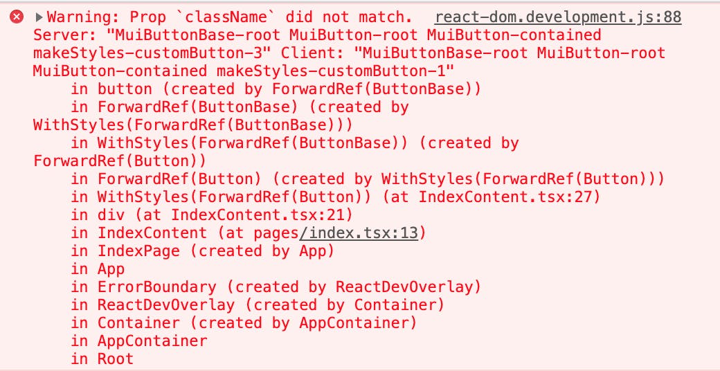
 However, if your button is grey, check your error console. You likely have an error like:
 The reason for the issue is that the server side of Next.js doesn't know how to handle the styles. The CSS compiles to HTML style tags that need to be included in the output on initial load.
Updating Next.js to Render Material-UI on the Server
As illustrated above, a hard server reload (vs. HMR refresh) illustrates that Next.js needs some updating to serve the correct styles on initial render. I will do this by updating the existing pages/_document.tsx to handle this. Since Next.js only runs _document.tsx on the server, it is the appropriate place to generate the css content and include in the output so the content is styled correctly on initial load. The only real addition to _document.tsx is the getInitialProps which does the bulk of the work needed.
The new content of /pages/_document.tsx should be the following:
import React from 'react';
import Document, {
  Html, Head, Main, NextScript, DocumentContext,
} from 'next/document';
import { ServerStyleSheets } from '@material-ui/core/styles';

class MyDocument extends Document {
  render(): JSX.Element {
    return (
      <Html lang="en" dir="ltr">
        <Head>
          <meta charSet="utf-8" />
          <meta name="viewport" content="minimum-scale=1, initial-scale=1, width=device-width, shrink-to-fit=no" />
          <style>
            {`
            body {
              background-color: ${process.env.NEXT_PUBLIC_THEME_BACKGROUND};
              color: ${process.env.NEXT_PUBLIC_THEME_FONT_COLOR};
            }
            `}
          </style>
        </Head>
        <body>
          <Main />
          <NextScript />
        </body>
      </Html>
    );
  }
}

MyDocument.getInitialProps = async (ctx: DocumentContext) => {
  // Render app and page and get the context of the page with collected side effects.
  const sheets = new ServerStyleSheets();
  const originalRenderPage = ctx.renderPage;

  ctx.renderPage = () => originalRenderPage({
    // eslint-disable-next-line react/jsx-props-no-spreading
    enhanceApp: (App) => (props) => sheets.collect(<App {...props} />),
  });

  const initialProps = await Document.getInitialProps(ctx);

  return {
    ...initialProps,
    // Styles fragment is rendered after the app and page rendering finish.
    styles: [...React.Children.toArray(initialProps.styles), sheets.getStyleElement()],
  };
};

export default MyDocument;
If you restart your application via npm run dev you should see the following on hard reload:

Customizing Global Theme
Now that I have a basic implementation of Material-UI working with Next.js, I will leverage one of the more powerful features of Material-UI: Theming. For illustration purposes, I'll customize the theme so button text is lowercase by default.
To get started, let's create a custom theme in ~/theme (remember, in part 4 of the tutorial I created a path alias for /src/):
// /src/theme/index.ts

// Define Theme to use for Material-UI
import { createMuiTheme, Theme } from '@material-ui/core/styles';
const muiTheme: Theme = createMuiTheme({
  typography: {
    button: {
      textTransform: 'none',
    },
  },
});
export default muiTheme;
Next I need to consume the theme. Material-UI does this by implementing a Theme Provider component. Any component below the Theme Provider component will have access to the them and styling. For my usage, I need to wrap the entire Next.js application. For this I'll introduce another Next.js access point _app.tsx. Like, _document.tsx, the _app.tsx is an optional integration point that Next.js allows to further extend behavior. Unlike _document.tsx, _app.tsx runs on both the server and the client. This is an optimal location to refresh the style output between route changes, hot reloads, etc.
Create a new file _app.tsx file in your /pages directory with the following content:
// /pages/_app.tsx

/* eslint-disable react/jsx-props-no-spreading */
import React from 'react';
import Head from 'next/head';
import { AppProps } from 'next/app';

import { ThemeProvider } from '@material-ui/core/styles';
import CssBaseline from '@material-ui/core/CssBaseline';
import theme from '~/theme';

export default function MyApp(props: AppProps): JSX.Element {
  const { Component, pageProps } = props;

  React.useEffect(() => {
    // Remove the server-side injected CSS.
    const jssStyles = document.querySelector('#jss-server-side');
    if (jssStyles && jssStyles.parentElement) {
      jssStyles.parentElement.removeChild(jssStyles);
    }
  }, []);

  return (
    <>
      <Head>
        <title>My page</title>
        <meta name="viewport" content="minimum-scale=1, initial-scale=1, width=device-width" />
      </Head>

      <ThemeProvider theme={theme}>
        {/* CssBaseline kickstart an elegant, consistent, and simple baseline to build upon. */}
        <CssBaseline />
        <Component {...pageProps} />
      </ThemeProvider>
    </>
  );
}
If everything works, you should see the following when you restart the application:
 If this is the case, then I am all set to utilize Material-UI with my Next.js application. This could be a good stopping point, but I'm going to add a couple additional things to clean up the Github Repo Template.
Applying Global Styles to the Theme
In the part 5 of the series, I introduced some environment variables to control the background color and font color of the page. In this part of the tutorial, I'll move those into the Material-UI theme. This will help keep all styles in a centralized pattern.
Let's remove the style tags from the _document.tsx. The new main MyDocument class should look like:
class MyDocument extends Document {
  render(): JSX.Element {
    return (
      <Html lang="en" dir="ltr">
        <Head>
          <meta charSet="utf-8" />
          <meta name="viewport" content="minimum-scale=1, initial-scale=1, width=device-width, shrink-to-fit=no" />
        </Head>
        <body>
          <Main />
          <NextScript />
        </body>
      </Html>
    );
  }
}
Now, update the custom theme to leverage these values:
// /src/theme/index.ts

import { createMuiTheme, Theme } from '@material-ui/core/styles';

const muiTheme: Theme = createMuiTheme({
  typography: {
    button: {
      textTransform: 'none',
    },
  },
  overrides: {
    MuiCssBaseline: {
      '@global': {
        body: {
          backgroundColor: process.env.NEXT_PUBLIC_THEME_BACKGROUND,
          color: process.env.NEXT_PUBLIC_THEME_FONT_COLOR,
        },
      },
    },
  },
});
export default muiTheme;
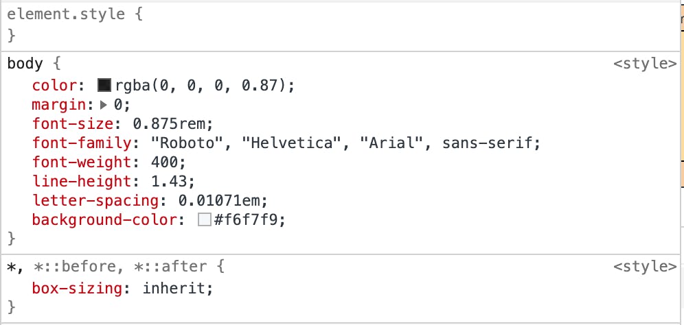
If you reload, the styles will be applied to the body. If you inspect the body, you will see that JSS has merged the globals into the defaults as opposed to creating a whole new declaration. This is handy as it results in a smaller overall bundle size.

At this point, I have Material-UI properly working with Next.js. I can customize individual components as well as change them globally through the Theme. I can also leverage the Theme to control the Global CSS stylings.
Bonus: Custom Theme Variables with TypeScript
As a final bonus feature I use a lot. I am going to add custom variables to the Theme that I can access inside of the makeStyles callback. I often use this to define Drawer widths for various breakpoints that I can then leverage for positioning other elements. Another case, is to define primary and secondary font faces and then have access to them. I'll do that here.
Material-UI by default uses the Roboto font everywhere. However, I like to make certain components use an accent font. Setting the font face everywhere you need it can be cumbersome, especially if you need to change it. As such, I can use a theme variable to define the font family. Just so it is painfully obvious when it works, I will use the Google Font Permanent Marker.
Load the font by adding the following to the <Head> tag in _document.tsx
<link href="https://fonts.googleapis.com/css2?family=Permanent+Marker&display=swap" rel="stylesheet" />
Then update the Theme to include the accentFontFamily variable:
// /src/theme/index.ts
const muiTheme: Theme = createMuiTheme({
  // Custom Variables
  accentFontFamily: "'Permanent Marker', cursive",
  ...
If I were using vanilla JavaScript, this is all I would need to do. However, I am using TypeScript and the TS compiler doesn't like that I am trying to add new values to Material-UIs theme.

To make TypeScript happy, I need to extend the Theme and ThemeOption types provided by Material-UI. This is as easy as declaring the module. I'll do this at the top of the /src/theme/index.ts
declare module '@material-ui/core/styles/createMuiTheme' {
    interface Theme {
        accentFontFamily: string
    }
    interface ThemeOptions {
        accentFontFamily: string
    }
}
The full theme should look like this now:
// Define Theme to use for Material-UI

import { createMuiTheme, Theme } from '@material-ui/core/styles';

declare module '@material-ui/core/styles/createMuiTheme' {
    interface Theme {
        accentFontFamily: string
    }
    interface ThemeOptions {
        accentFontFamily: string
    }
}

const muiTheme: Theme = createMuiTheme({
  // Custom Variables
  accentFontFamily: "'Permanent Marker', cursive",

  // MUI Typography Overrides
  typography: {
    button: {
      textTransform: 'none',
    },
  },
  overrides: {
    MuiCssBaseline: {
      '@global': {
        body: {
          backgroundColor: process.env.NEXT_PUBLIC_THEME_BACKGROUND,
          color: process.env.NEXT_PUBLIC_THEME_FONT_COLOR,
        },
      },
    },
  },
});
export default muiTheme;
Finally, I will update Button from earlier to utilize the new variable.
const useStyles = makeStyles((theme: Theme) => ({
  customButton: {
    backgroundColor: '#6f2da8',
    color: theme.palette.common.white,
    fontFamily: theme.accentFontFamily,
  },
}));
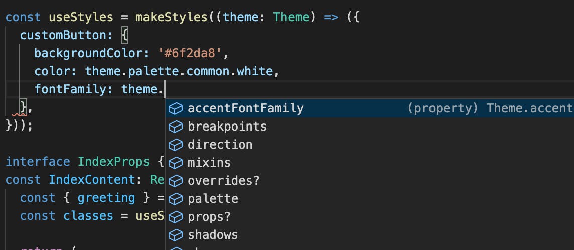
Notice, I get the benefits of auto complete in the IDE when I augment the Theme.

Finally, if you reload the app, you should see the fontFace applied to the button.

Closing Thoughts
At this point, I have have a pretty solid Github Repository Template for my usage. In the next part in the series, I will add basic PWA support. To view the full changeset covered in this post or check out the 0.0.6 release of the repository.
Discussion Topics
- Have you used both Styled Components and JSS? Which do you prefer and why?
Image Credit: Several Bunches of Grapes by Luiz M. Santos from Pexels

