Snippet: Material UI Responsive Icon Button
A quick code snippet to hide button text on small screens using MUI and TypeScript
I'll find something good to put here.
From time to time, I find myself needing a Material UI Button with an icon and label that collapses the label text down on smaller screens, essentially turning it into an IconButton. I've written various approaches to this several times and decided it was time to post the code for the next time I need to find it.
Goals:
The
Buttonlabel text hides below a certain MUI breakpointTarget breakpoint can be passed as a prop with a sane default (
'sm') but not spread onto the button componentUtilizes MUI styled components with props
Utilizes TypeScript and uses MUI
BreakpointstypeFor my purposes, default the
Buttontovariant="outlined"andcolor="primary"tweak some default styles.
The Code
// Responsive Icon Button
import React from 'react';
import Button, { ButtonProps } from '@mui/material/Button';
import { styled } from '@mui/material/styles';
import { Breakpoint } from '@mui/system/createTheme/createBreakpoints';

interface ResponsiveIconButtonProps extends ButtonProps {
  breakpoint: Breakpoint;
}

const ResponsiveIconButtonStyled = styled(Button, {
  shouldForwardProp: (prop) => prop != 'breakpoint',
})<ResponsiveIconButtonProps>(({ theme, breakpoint }) => ({
  fontSize: theme.typography.pxToRem(14),
  minWidth: 'auto',

  [theme.breakpoints.down(breakpoint)]: {
    minWidth: 32,
    paddingLeft: 8,
    paddingRight: 8,
    '& .MuiButton-startIcon': {
      margin: 0,
    },
    '& .buttonText': {
      display: 'none',
    },
  },
}));

export default function ResponsiveIconButton(props: ResponsiveIconButtonProps): JSX.Element {
  const { children, ...rest } = props;

  return (
    <ResponsiveIconButtonStyled variant="outlined" color="primary" {...rest}>
      <span className="buttonText">{children}</span>
    </ResponsiveIconButtonStyled>
  );
}

ResponsiveIconButton.defaultProps = {
  breakpoint: 'sm',
};
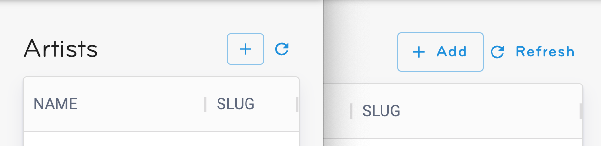
The below image shows the final component in action at two different breakpoints.
But Why?
Material UI is extremely flexible and I love working with it. However, when attempting to hide button text/label without any additional markup, I couldn't get an "edge" in CSS to select specifically the text. Below you can see a modified version of the rendered HTML from the Material UI Button component with an endIcon. Note that in the rendered output the label "Send" doesn't have a wrapper element.
// React Code
<Button variant="contained" endIcon={<SendIcon />}>
  Send
</Button>

// Rendered markup (with classes removed)
<button>
  Send
  <span>
    <svg><path d="M2.01 21 23 12 2.01 3 2 10l15 2-15 2z"></path></svg>
  </span>
</button>
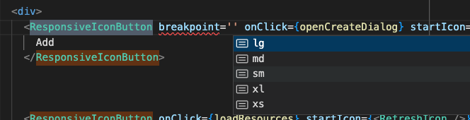
Also, in previous attempts at this, I hardcoded the breakpoints, which felt silly. Utilizing the Breakpoint type from MUI makes for nice auto-completion in VScode.
Notes:
The above code was tested in MUI 5.10.1
Thanks to Ryan Cogswell for proposing this basic solution to me on Stack Overflow in 2020.